Wednesday, September 06, 2006
Friday, September 01, 2006
Down to Earth


I'm having second doubts about this one, but I promised I'd show you the zoom effect applied to the ice image.
All the letters created from standard hebrew font. I think a little artistry on them would help a lot. As it is, they look manufactured.
Then there's the "Sefirot Map" which was also created from scratch, and can also use artistry.
You know what? I'll try not to use this untill I'm happy with it.
Tuesday, August 29, 2006
Shabbos
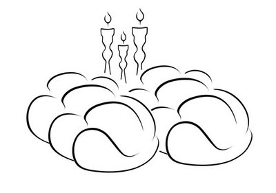
I made this art myself, tracing an image. If you think that sounds easy, listen again.
At one point I got very discouraging comments about this piece, and I pretty much gave up on it, hoping it was good anyway. Recently, I rediscovered it and showed it to some people I thought might be interested. They ate it up. So now I've regained my self-confidence. This is supposed to be an image about me blog, not a text about me blog.
Bye.
Wednesday, August 16, 2006
Presenting
Classic.
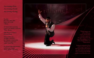
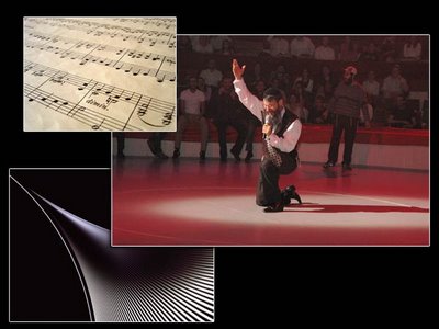
Fonts: Mona Lisa and Adobe Jenson Pro. They're not too bad, though I've heard complaints.
Here's a link to the original Avraham Fried picture. I want you to see how grainy, blurry, and not vibrant it is. Was. Before it met me. I'm not conceited.
This design was also used by Yeshiva Something of Minnesota with permission. Good.
Friday, August 11, 2006
Tuesday, August 08, 2006
Friday, August 04, 2006
Thursday, July 27, 2006
Bubbe
Education
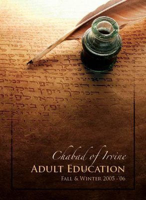
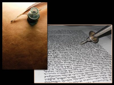
No, you've never seen this before. It's never been published before; how could you have seen it? (rhetoric) But I do take it as a compliment anyway.
And don't tell me anything about messed up 3D. You know who you are.
Fonts: Zapfino (for all your "all your" needs), and Trajan Pro. I might mention that although this was one of my earlier works, I managed to scratch some great font choices. They are each perfect for the setting, and work well together. I'd use them again. I'm not conceited.
Wednesday, July 26, 2006
Ice
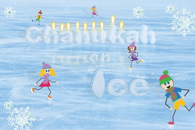
To tell you the font would be completely useless, and I'm surprised you even asked. It's not a font. Well, it used to be. Each letter was individually crafted into what it is now. Font is irrelevant. Don't ask again.
Elements in this image are:
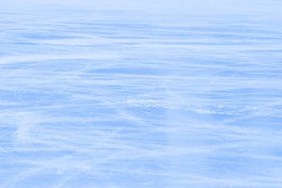
1. Ice image. The same as you see it just without everything else. Fine. I'll show it too. (Note: this image was a source for a sweet zoom effect that you may get to see within a span of time or two. If you're lucky.)
2. Letters. Individually crafted. Original font: go away.
3. Flames. Were added as an afterthought. Came from a candle image, I suppose.
4. Skaters. They're vectors. What you see is what you get.
5. Snowflakes. They're also vectors, hello.
Bonus: Notice that every element (except the snowflakes) has a shadow and a reflection. Hint: That's what tells your brain this really could have happened.
What?
Saturday, July 22, 2006
Davai Veebum
Tuesday, July 18, 2006
Thursday, July 13, 2006
Creative
Sunday, July 09, 2006
Alien
Thursday, July 06, 2006
Tuesday, July 04, 2006
Monday, July 03, 2006
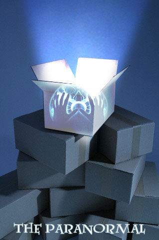
Paranormal
Monday, June 26, 2006
Fire
Friday, June 23, 2006
Subscribe to:
Comments (Atom)
