Classic.
Fonts: Mona Lisa and Adobe Jenson Pro. They're not too bad, though I've heard complaints.
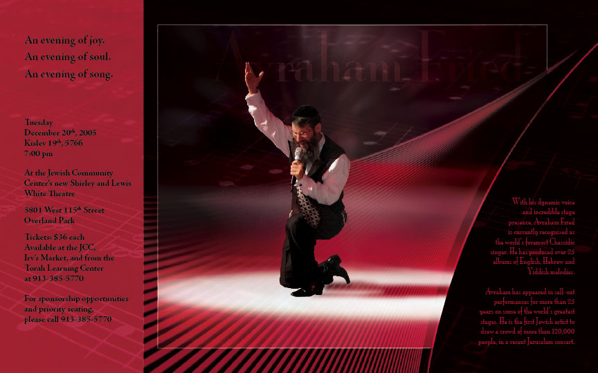
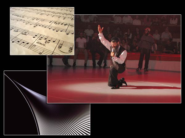
Here's a link to the original Avraham Fried picture. I want you to see how grainy, blurry, and not vibrant it is. Was. Before it met me. I'm not conceited.
This design was also used by Yeshiva Something of Minnesota with permission. Good.
2 comments:
Did you mess around with his shoes?
a little, i guess.
Post a Comment